Happy new year! We have just done our first release of SCaml, version 1.0 “Pyramid”.
SCaml is yet another OCaml compiler to Michelson VM used for Tezos blockchain.
SCaml’s primary goal is to build a fully working high-level programming language for smart contracts with the least efforts. For this purpose we have decided to make it over an existing language and chose OCaml as the base. We avoided adding any extra language feature. Primarily it was to reduce the development cost, however we soon found several benefits of keeping it a strict subset of OCaml. OCaml programmers can write smart contracts in SCaml immediately without lots of surprises. Tools around OCaml can be used for SCaml almost for free, and so on. For more details, please read our previous post “SCaml: it’s not a scam”.
Today I cover something non technical.
The name
The name “SCaml” was made seriously, following our tradition of naming of OCaml variants and there was no joke about it. Simply it was Caml for Smart contracts.
Indeed it is a good acronyum: the old Caml compiled code down to CAM, Categorical Abstract Machine, thus called Categorical Abstract Machine Language. SCaml is compiled down to Michelson, abstract machine for smart contracts, thus Smart Contract Abstract Machine Language.
It did not take a long time for me to notice that it starts with “scam”. And I liked it a lot. The other candidates such as “Humidity” (since the first idea came into my mind when I was in Singapore) were kicked away immediately.
It seems the name was fixed at the first commit already:
commit fc4d9d5c4e8337677f0f687553332863a182eada
Author: Jun Furuse <jun.furuse@dailambda.jp>
Date:   Tue Sep 3 10:41:41 2019 +0000

    first commit scam language
It has started as my private project, but the joke was too good to let it rotten unnoticed. When I have decided to make it public, the name became a binding: I could not release something scammish with that name. Yes, project names sometimes really matter!
The domain name
It is scamlang.dev.
I heard something fishy is going around org, so I avoided it.
io was not bad, but the language is purely functional without I/O, and io is a bit more expensive.
dev is newer and suitable for R&D projects.
I just followed a trend to add lang at the end to make it clear that it is a programming language project. scamlang was clealy better to complete the joke and to pronounce than scamllang or scaml-lang.
The logo
I like doodling since my childhood. I am not sure I am good at it, but I always enjoy making logos of my projects.
The logo of SCaml must be a camel but this time I wanted it not humpy. A hump is really a good symbol but too easy. You can change anything into camelish just by adding one hump. And the logo should depict “S” of SCaml.
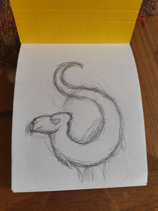 The first idea. Clear "S" here, but it looks like a snake or a dragon.
Even if I put legs it would never look like a camel.
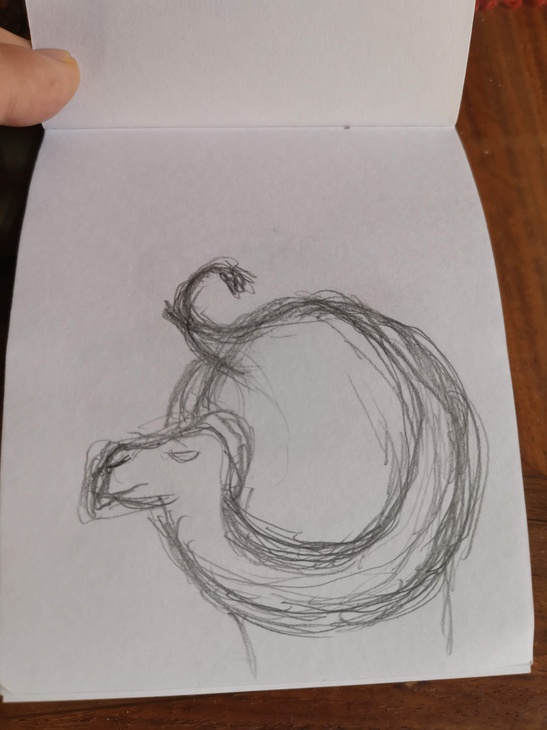 Introduced a big round body. "S" is now the tail and the long neck
of a camel.
Introduced a big round body. "S" is now the tail and the long neck
of a camel.
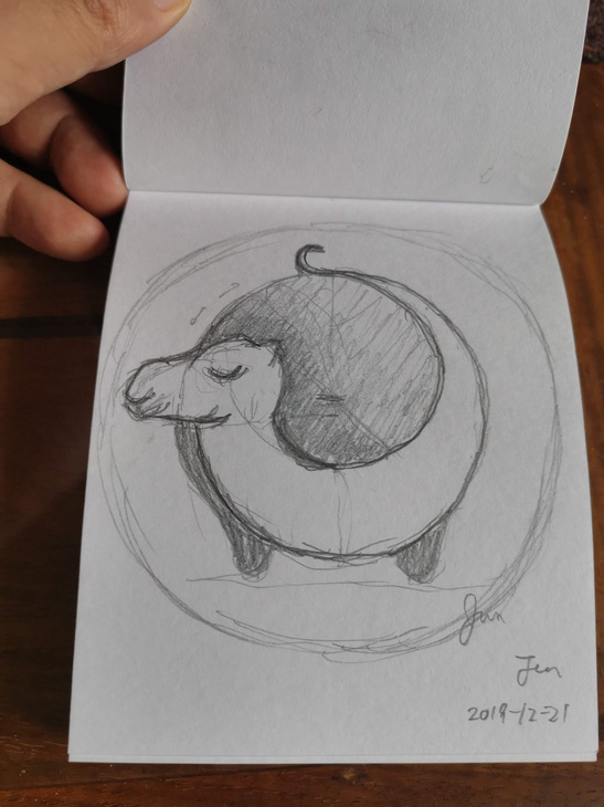
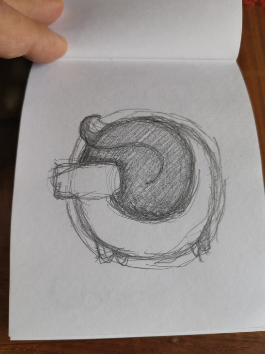 Changing the proportion. Enlarged the head for the better visibility.
 Detailed the head since it is the only part which makes it a camel
without a clear hump. The name "SCaml" should also help the recognition.
But now it is hard to get "S" from the logo.
Detailed the head since it is the only part which makes it a camel
without a clear hump. The name "SCaml" should also help the recognition.
But now it is hard to get "S" from the logo.
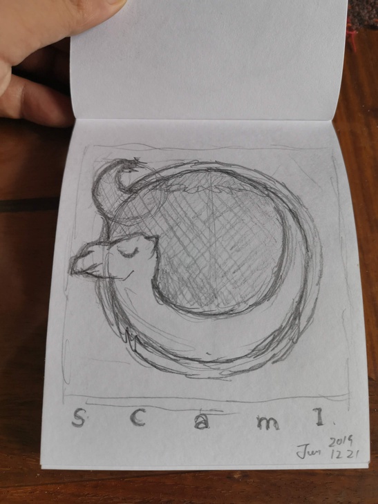
 Move the tail at the top so that the shape is more like "S".
The bigger head and 2 legs made the recognition easier.
Move the tail at the top so that the shape is more like "S".
The bigger head and 2 legs made the recognition easier.
I like this. Cute isn’t it?
 Traced by Inkscape. Typical disaster.
Every good feeling in the hand writing dessign is lost
when converted to geometrical objects.
Traced by Inkscape. Typical disaster.
Every good feeling in the hand writing dessign is lost
when converted to geometrical objects.
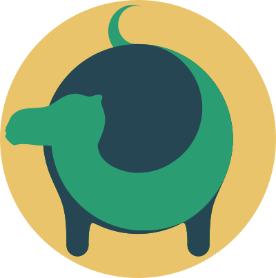
Cuteness is gone and I only see a heavy quadruple moving slowly.
 Put a hole in the middle to reduce the "weight". A good change.
Now the camel looks bending its body to prepare some movement.
Put a hole in the middle to reduce the "weight". A good change.
Now the camel looks bending its body to prepare some movement.
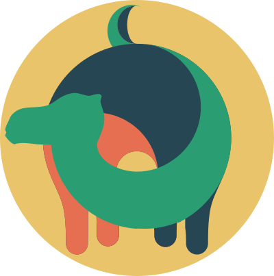 Added another color to give more "spiral" to the image.
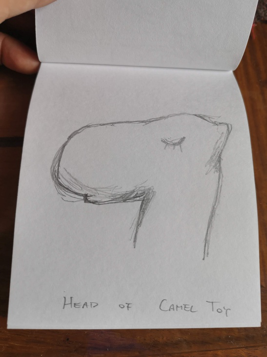 Sketch from one of my camel toys.
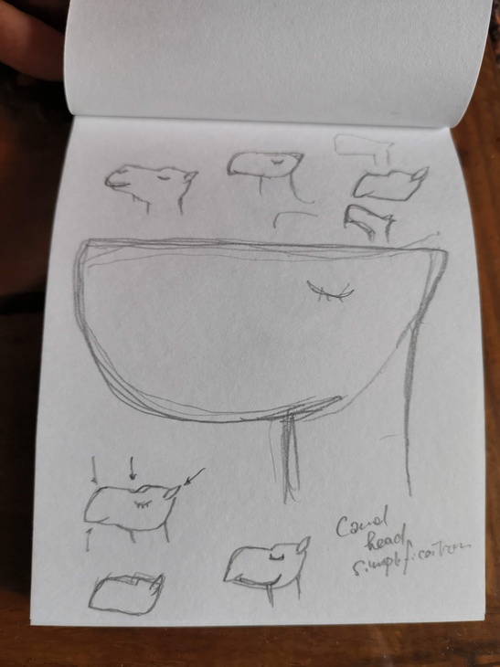 Some trials of heads.
 I noticed the head is too low and not looking very energetic.
Tried several ideas of “heads-ups”.
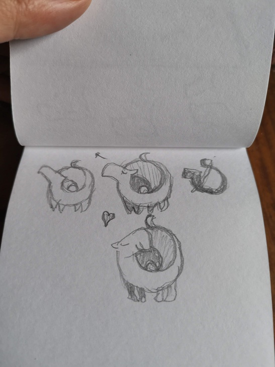
 Almost final. The head looks up. If I raise it more then his neck bone
should fracture. Hard to read the letter "S" from this but I really like
the spiral design.
Almost final. The head looks up. If I raise it more then his neck bone
should fracture. Hard to read the letter "S" from this but I really like
the spiral design.
Just like the hump, I did not want the typical yellowish color of camel
for this time. The colors were chosen almost randomly but they matched with
our green company logo.
 Logo for the release "Pyramid". Better recognition of "S".
It looks like a snake again but now not a big deal since people can
see a camel (I hope!) in the main logo.
Logo for the release "Pyramid". Better recognition of "S".
It looks like a snake again but now not a big deal since people can
see a camel (I hope!) in the main logo.
The logos are too clean and (maybe too cute) for the joke of the name, but for me it is too hard to draw a “scammish camel logo”.
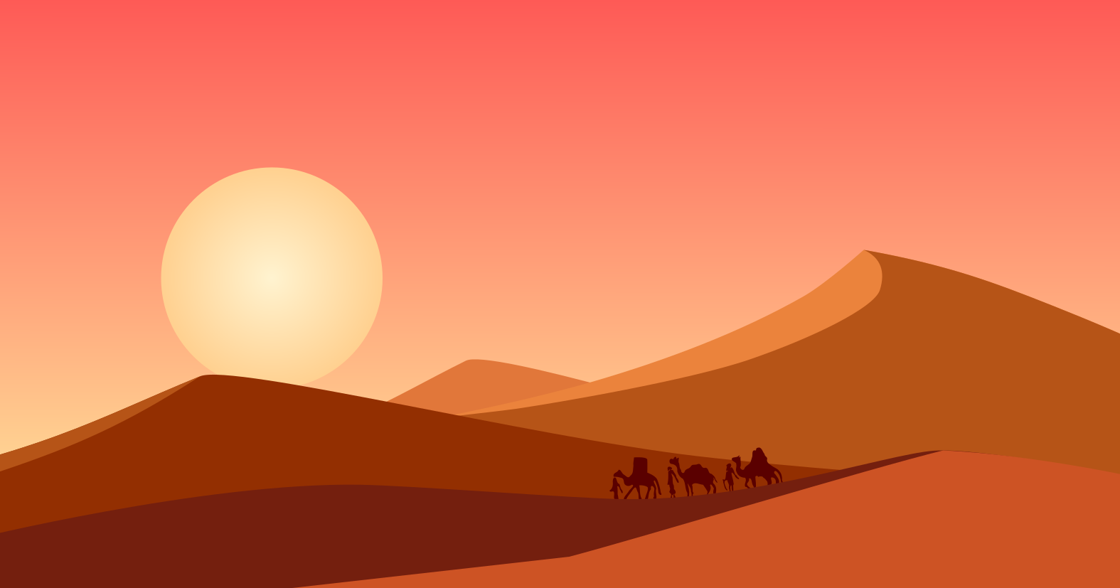
The cover image
The cover image was drawn quickly using Inkscape from scratch. I wanted to add some pine trees, an oasis, or a pyramid, but I had no time except the caravan. The caravan image was taken from a very old South Asian textile (Indonesian batik maybe). It was done only with a touch pad. I was on vacation at my parents’ and there was no mouse!
SCaml in action!
OK, that’s the back-story of SCaml. We hope SCaml will be used in several projects in this year 2020. We promise keeping it simple and straightforward, so please try it out!